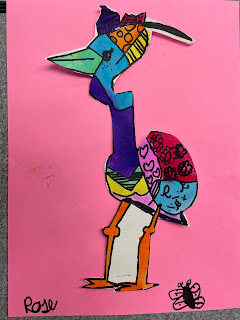
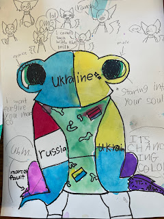
My 2nd grade students are studying Pond Life and Romero Britto is so much fun I thought they would enjoy making a bright and colorful frog in his style.
Then we did a directed drawing of a frog, they didn't have to do a frog, if they felt confident enough they could do another pond animal.
I like to do directed drawings as an option because some students are so intimidated by drawing and also it helps them to draw nice and big and fill the page with the painting instead of a little frog in the center of the page. They also learn how to translate an image into lines and shapes which will help them draw on their own.
We started by doing the middle line between the eyes and then added the two bumps for the eyes.
Then the lines down and outward from the eyes and an arc for the base of the face. Two curved lines for each of the front feet, the bottom of the front feet and add the inside curved lines for the front feet. Finally the two bumps for the back feet and the toes at the bottom.
Once they had the outline we used up to 5 straight or curved lines to divide the space within the drawing.
I asked them to do their best to create balance with the spaces.
I kept the Britto Images of Frogs on the Promethius for them to refer to.
We had already discussed Britto's use of pattern within his painting. He puts his initials in his designs so I encouraged my students to also add their initials to their design. We discussed balance and how he balances his colors and his patterns. I asked them to look at their frogs and be sure they were balanced in terms of pattern.
The next step is to go over their lines with a fine point Sharpie which won't bleed when we do the watercolor over the top.
 |
| They erased their pencil lines and prepared to start painting. |
We discussed warm and cool colors, complimentary colors and balancing colors like Romero Britto does.
We used liquid watercolor because it is so vibrant.
I only gave them one color at a time and asked them to paint one or two sections of their animal.
Each time I gave them another color I asked them to balance this color with what had already been painted and to think about which colors look best next to each other.
They really had fun doing this project and were happy with their finished work. Below are several examples of what my students created.
Some of the artists chose to cut their frog out and put it on another piece of paper. Others painted the background - I love how they turned out!


